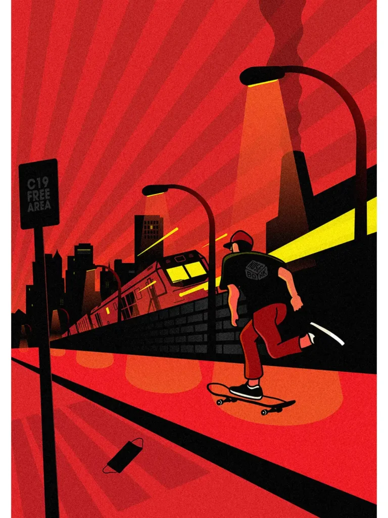
The Nosebonk
Skateboarding
Project
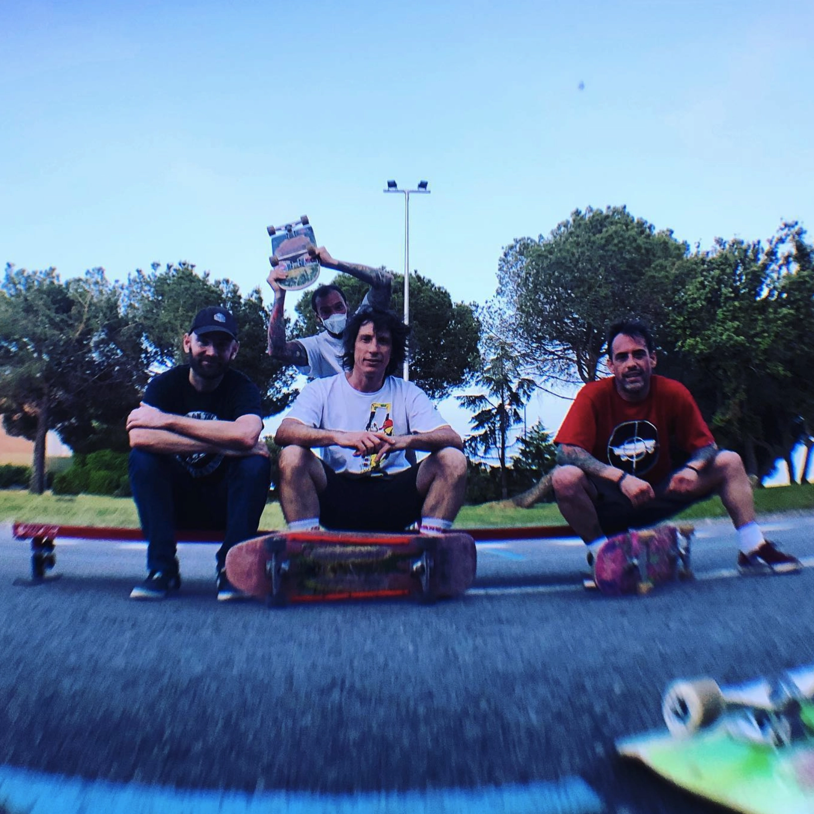
Nosebonk is an independent skate & art project — from Madrid.
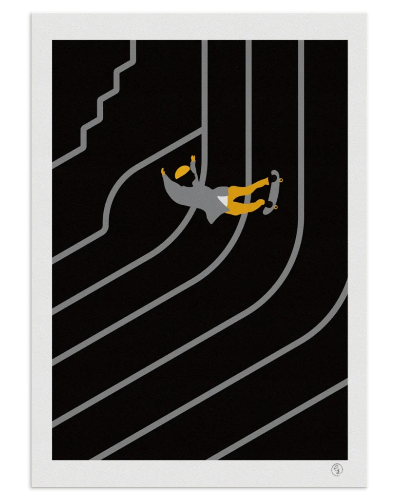
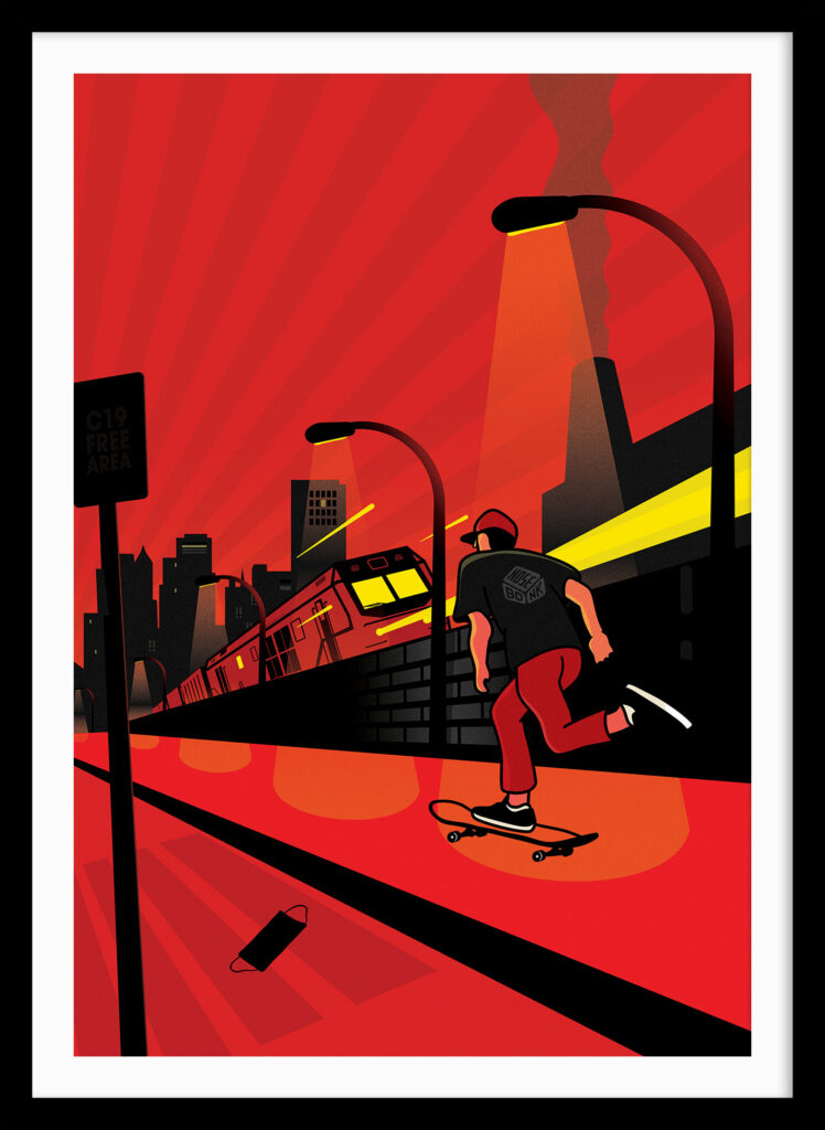
Blending skateboarding and graphic design, we create limited-edition prints, tees, and decks crafted in our home studio in Madrid to give back to skateboarding through visual expression.
After years leading creative teams with no time to design myself at work and after some years back on the board — I felt the need to create again, to pay back a personal debt to skateboarding through design and stay close to the culture that shaped me.
Today, Nosebonk is an independent skate art project & brand — a platform where skate art, print design, and visual storytelling converge. Built from obsession, gratitude, and a need to keep the culture alive, everything you see from stickers to prints, tees, and collaborations was made after work, for fun, and out of love for skateboarding.
“Nosebonk is about creativity & mixing art styles with and for skateboarding.
—
Being eclectic, curious & progressing. Just like skateboarding.”
Nosebonk was named after my favorite trick growing up
— the nose bonk.
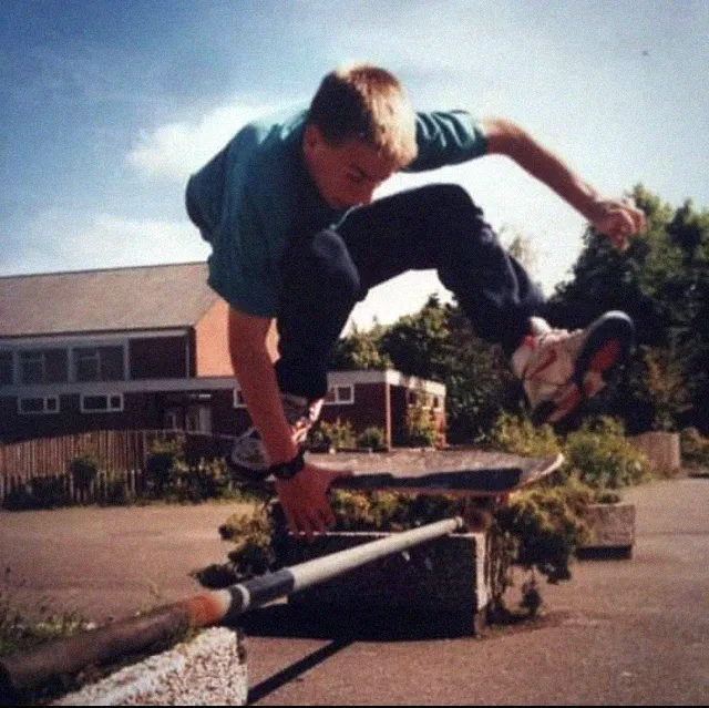
In the early ’90s in Bilbao, that was my move: ollie, bonk, land. I would bonk anything I could find — curbs, rails, trash cans, street gaps , always chasing that perfect mix of timing, sound, and flow.
“That bonk moment, when the front truck hits and snaps back, was the best feeling in the world.”
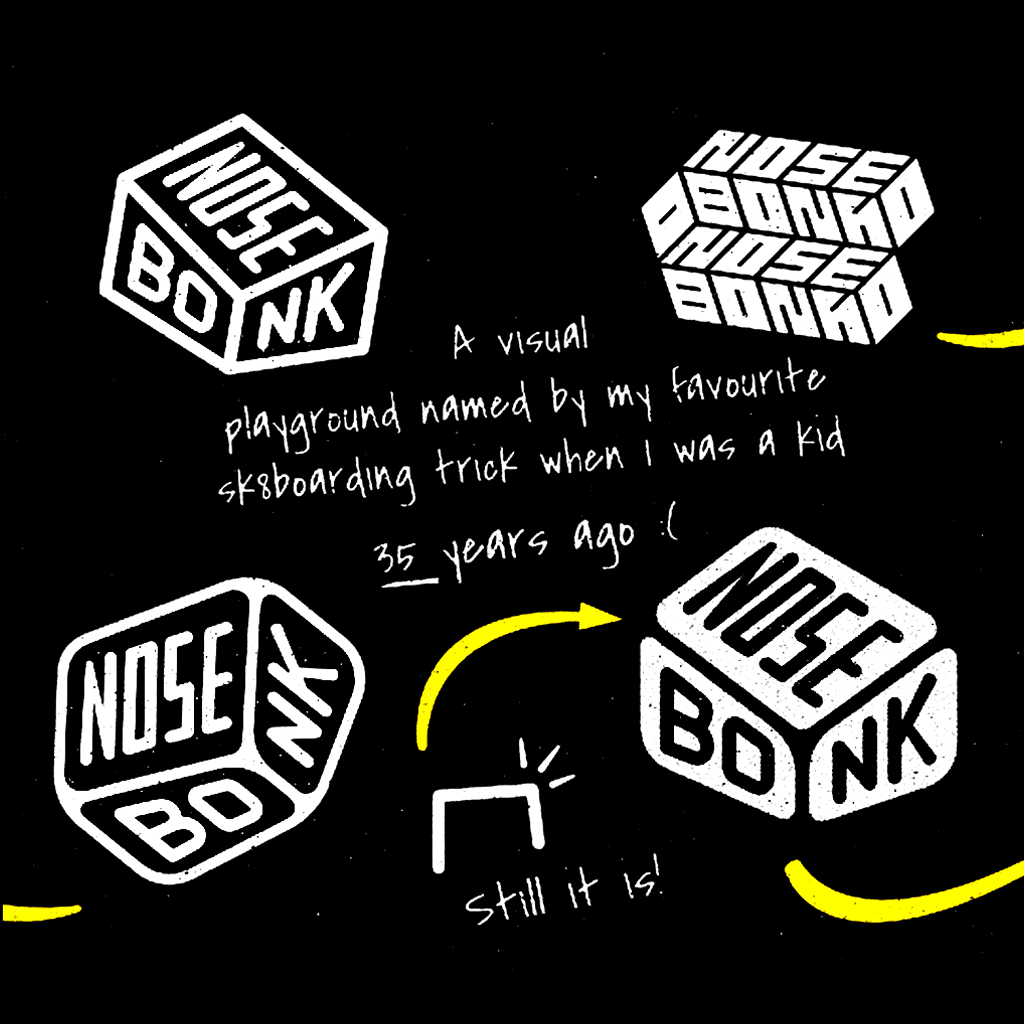
The name is a tribute to that feeling, and to one of the most beautiful and underrated tricks in skate history.
It’s also a name only real skaters would notice, not something as easy to recognize as kickflip, that was really important for me.
I wanted something coded something that speaks directly to those who grew up in the culture and don’t need an explanation. Like a spot only we see as a spot, Nosebonk is a quiet nod to the ones who know.
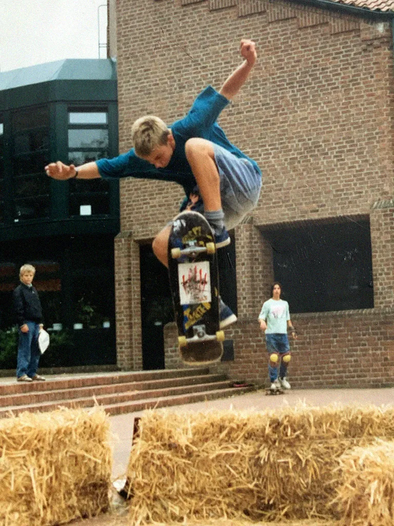
“There’s something I love about skateboarding
— the hidden, coded language it’s built on.”
The shape should speak a language real skateboarders understand.
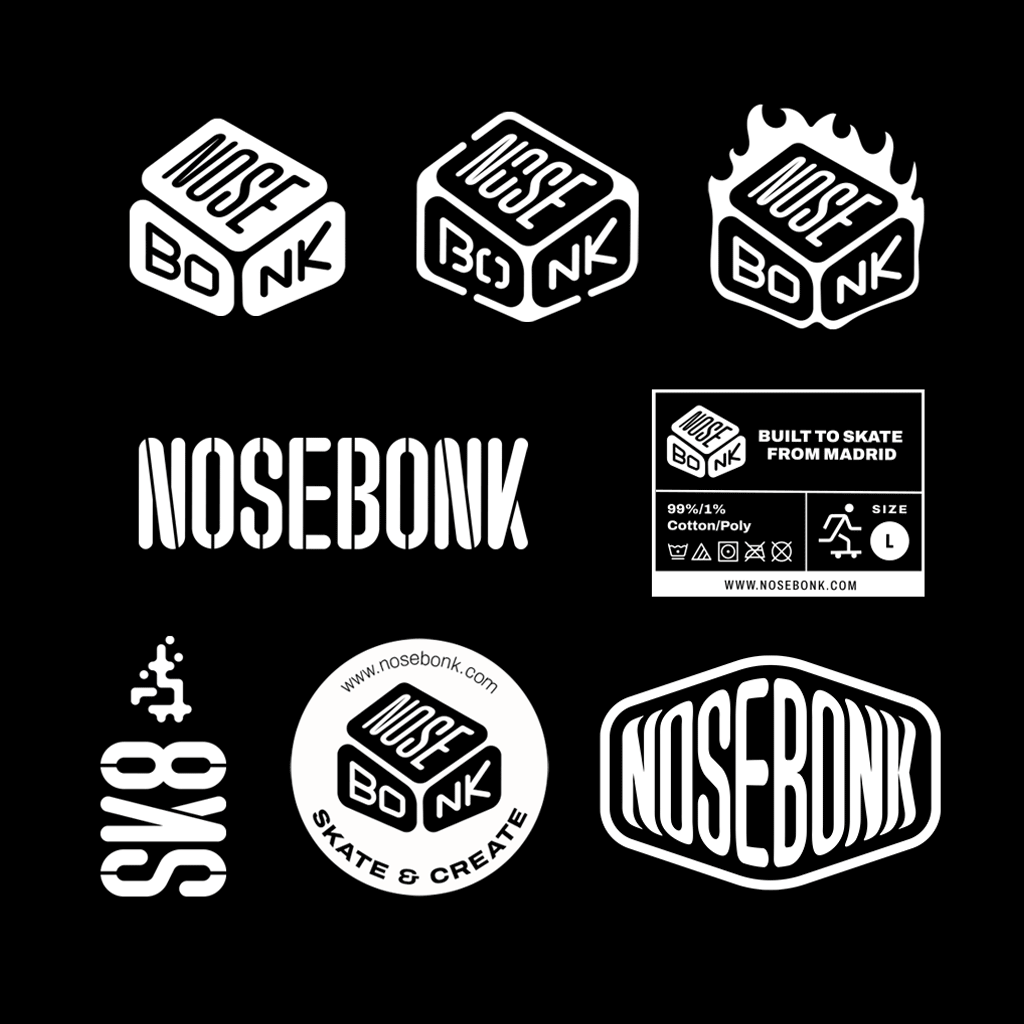
Why this symbol?
When I designed the Nosebonk logo, I wanted it to feel bold, a bit old-school, and unmistakably skateboard-related but only for those who truly know.
Back in the 90s, I was drawn to logos like H-Street or Independent — strong, black symbols with sharp edges and presence. But I also loved the softer recognizability of something like the Powell logo, so I added softened corners to balance the sharpness.
I also wanted it to feel old. Like a sticker you’d find in a dusty box of skate stuff from 1992. That’s who I’m speaking to — skaters who grew up with this culture and recognize the visual language without needing an explanation. It’s a name, a symbol, and a trick — all in one.

