Skate Art Stories / Explained
What if skate had existed at Munich 72 Olympics?
Some prints start with a question. This one took me through skateboarding graphic design history from Egypt to Vienna to Munich and back to Bilbao, the city where I grew up.


Otl Aicher Skates Bauhaus
This print has no skulls, no graffiti, no obvious skate reference. It’s the print that gave Nosebonk its direction. Let me tell you why.
If you grew up skating in the late 80s or 90s, your visual references probably look like mine: skulls, punk, complex illustration, the Powell Peralta, New Deal, Alwa, or the creepy Zorlac era. But I also studied graphic design. For a long time those two worlds lived in completely separate brain compartments. A visual dyslexia I didn’t know how to resolve until skateboarding and graphic design history finally connected.
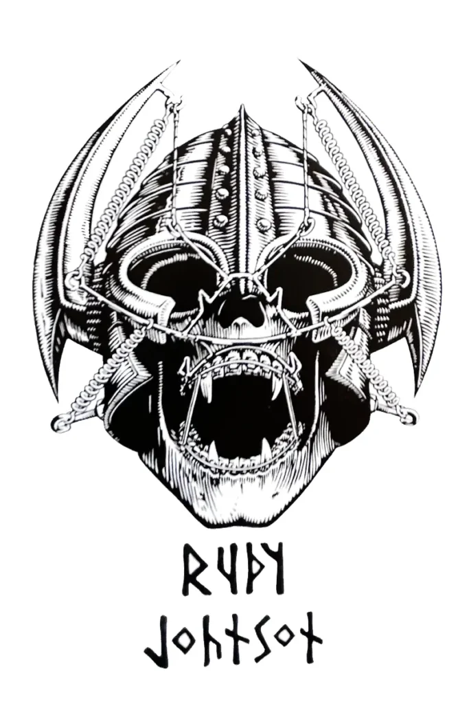
Rejected Rudy Johnson graphic was turned down for being too close to the Welinder skull.
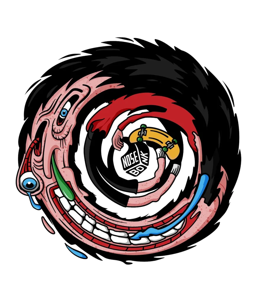
No Speed No Fun. Erik Ziegler for Nosebonk. Complex illustration, expressive, oldschool skate visual language.

3. Where I ended up.
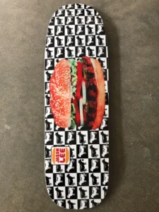
Go Skate Flow. Erik Ziegler for Nosebonk. Flat color, geometric figure, reduced to essential movement.
A note before you read: this post is not really about the print. It’s about the joy of learning by doing tracing the visual language behind a piece of work back to its sources. If you came for the poster, it’s at the end. If you stay for the history, begin to read.
When I stopped skating I missed something without knowing it.
The late 90s and early 2000s were the moment skate graphics got closest to what I was studying. The Girl era. Chocolate. Habitat. Alien Workshop. Flat color and clean type that didn’t need a skull to say something.

That was the intersection of skateboarding and graphic design history.
I just didn’t have a name for it yet.
That missed window always bothered me. Otl Aicher Skates Bauhaus is the print where the AHA moment happened. Where I stopped trying to resolve the dyslexia and started using it. Where I understood that the space between Powell and Swiss design is not empty. It’s exactly where Nosebonk lives.
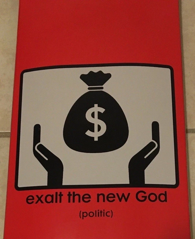
MUNICH 1972 — A COLOR PALETTE AND A GRID
Otl Aicher is a graphic design icon for his identity work for the Munich 1972 Olympics. Not just a logo. A system. A mathematical grid where every sport followed the same geometric rules. And a colour palette that wasn’t chosen for aesthetics. It was an argument.
Aicher banned red, black and gold from the start. The colours of 1936 weren’t allowed near the place. What entered came from the Bavarian Alps: that flat blue, the silver of the lakes, the green of the foothills. He called it a tribute to Bavaria. The rest of the world called it the Rainbow Games.

I came for the colours first. That flat blue. The green. The orange against silver. Aicher’s palette looks simple until you try to use it. Only certain combinations hold when you place flat colour against flat colour. It took me a while to find the ones that worked. I wanted to know if that system could hold a skater.

Behind the colours there is a grid. A mathematical system where every sport was reduced to its essential gesture — one figure, one movement, no decoration. Every pictogram followed the same geometric rules. Same angles, same proportions, same discipline. I started wondering: what if skateboarding had been an Olympic discipline back then? What would an Aicher pictogram for pushing look like?
That visual language didn’t stay inside the Olympics. It influenced many fields of daily life.
WHERE DOES SKATEBOARDING GRAPHIC DESIGN HISTORY COME FROM?
Many skate brands, Girl Skateboards, Alien Workshop, Habitat Skateboards among them, have used international symbols and pictograms to represent ideas. But where does that visual language actually come from?
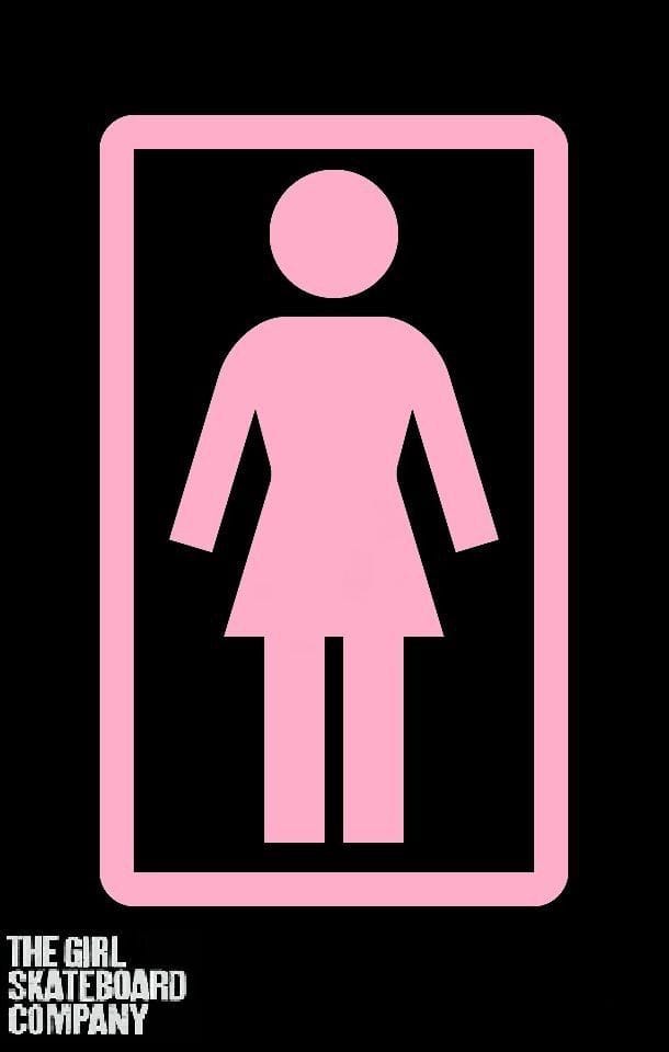
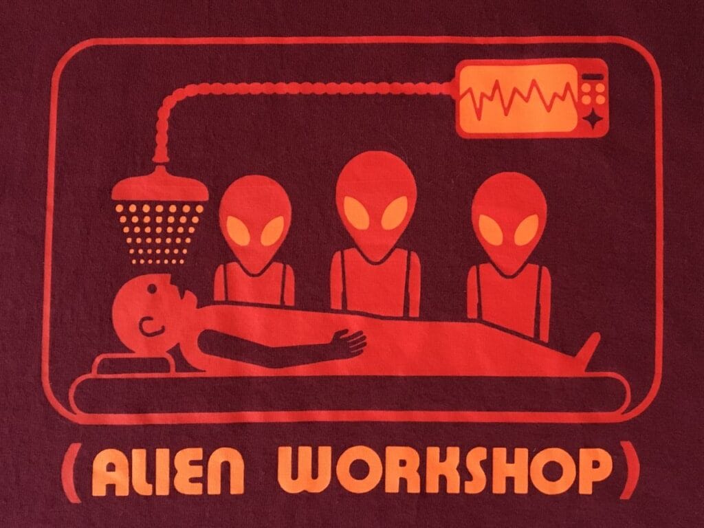
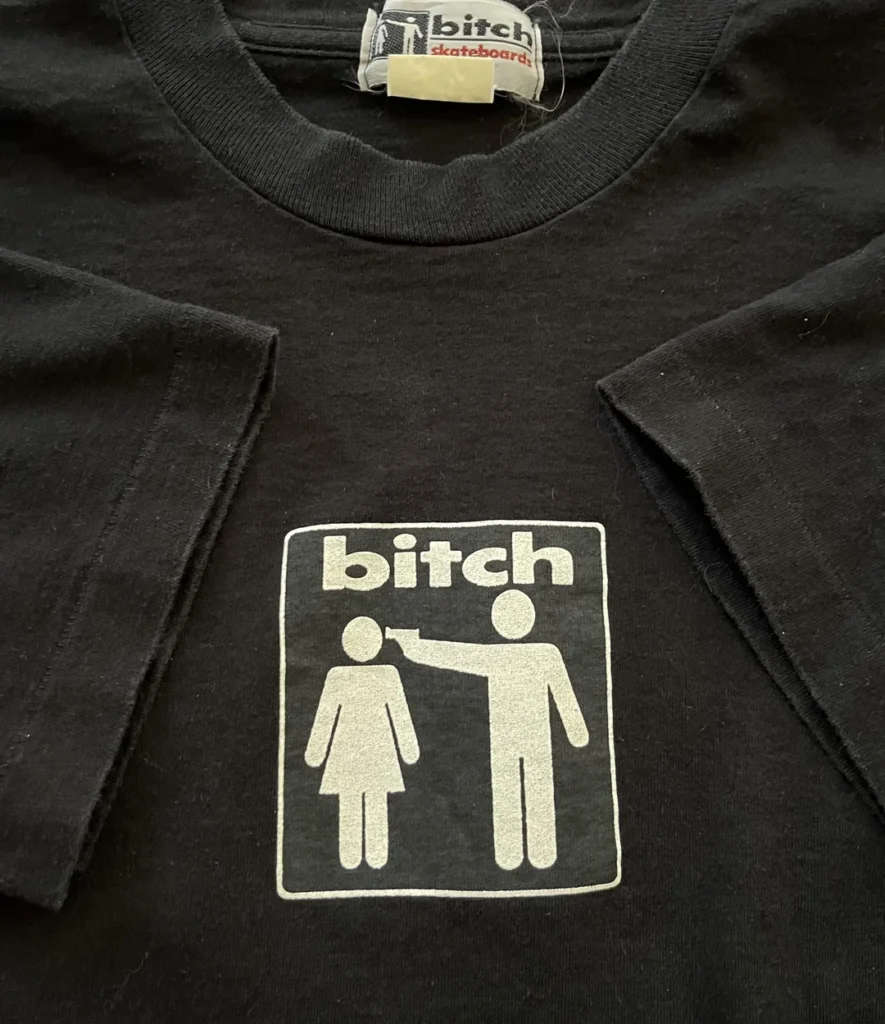

Skate graphics using international symbol language. Girl Skateboards, Alien Workshop, Habitat, Bitch Skateboards.
Aicher didn’t invent that language. To understand where it came from, you have to go back to Vienna in the 1920s.
Before Aicher. Before skate graphics. There was Isotype.
The real story starts in Vienna during the 1920s. Or, as you can probably guess, much earlier in Egypt. But let’s stay a little closer to our timeline. Philosopher Otto Neurath and illustrator Gerd Arntz developed Isotype, a visual language built from simple pictograms designed to communicate across languages and cultures. Neurath provided the vision. Arntz drew the symbols. Together they helped establish a graphic language that would influence generations of designers, from information graphics and wayfinding systems to Olympic pictograms and public signage. Reduce information to its essential shape. No words needed. This is where skateboarding graphic design history gets its cleaner visual language from.


This graphic language was being built in the 1920s. Skateboarding wouldn’t exist for another forty years. That gap is what keeps pulling me back to Arntz. Aicher knew this tradition. His Munich pictograms were built on the same principle: the human body reduced to geometry, legible at a glance.
REFERENCEs
The work of Gerd Arntz (1900-1988) is of great importance to the world of visual communication.
The language of everyday objects
Skateboarding has always had a point of social commentary. Sometimes through satirical illustration, sometimes through everyday symbols recontextualized to tell a different story.

Alien Workshop didn’t use pictograms by accident. That visual language, built for mass communication and public signage, was the perfect tool for a subculture that had something to say. How skate culture adopted the iconography of daily life to carry its own message is a story worth telling on its own. That post is coming…
Everyday graphics applied in skateboarding culture


For now, another influence that connected all of this for me: the exit man.
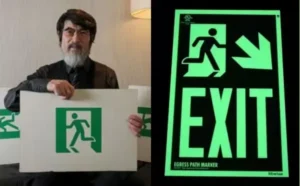
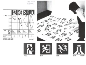
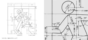
The exit man. Yukio Ota, 1979.
I started looking for geometric ways to represent a figure in motion. I kept coming back to the most recognized one: the exit man.
")
I’ve used the EXIT pictogram in my own work many times, designed by Japanese designer Yukio Ota in 1979. But I’d never looked into where it came from. When I did, it made complete sense: the same geometric vocabulary as Aicher, the same reduction of the human body to pure signal. At the time this was created I was 3 years old.
REFERENCES
Further reading.
ISO: Global standards for trusted goods and services
ISO 7010 E001 — the international standard behind the running man exit sign. Official registry entry.
The Battle Over the Exit Sign
The New York Times, 2010. How a Japanese designer’s running man became the global standard — and why the US resisted for decades.
People’s Graphic Design Archive — ISO 7010 E001
peoplesgdarchive.org. Design history, context and visual documentation. A community-built graphic design archive worth knowing.
From Japan straight back to the Bauhaus
Looking for geometric Bauhaus ingredients led me to the “Bauhaus Running Man” you see in hundreds of poster shops sold as a 1923 original. It isn’t. No museum holds it. It’s a modern pastiche inspired by the visual language of the school, anonymous, collective, built from a hundred years of the same vocabulary being passed around and reinterpreted. Exactly like skateboarding.
Geometric human representation:

The real historical source behind that visual language is Oskar Schlemmer. Master of the theatre workshop at the Bauhaus in Weimar. His Triadic Ballet (1922) transformed the human body into geometric sculpture: cylinders, spheres, rectangles. He called it Kunstfigur, the art figure. The body reduced to its essential movement, freed from anatomy. A hundred years before skate graphics, he was already doing what the best skate graphics do: finding the geometry inside the motion


video REFERENCE
For various reasons, The Triadic Ballet has rarely been restaged, though its influence on futuristic dance and costuming is considerable.
My print stands on all of this, not as rigorous but at least as fun to create. Aicher’s grid. Schlemmer’s geometric body. Ota’s universal language. And a skater pushing through Munich colors on a Saturday in Madrid.
This story leads back to the Basque Country. Early 90s.
Portugalete, early 90s. Pink shirt, Alva sticker, H-Street Matt Hensley deck. We were street rats, no ramp at all. That summer Alva came to town. I still remember Eddie Reategui’s demo at Mungia Skatepark.
Few places have shaped my skateboarding and way of life more than the Basque Country.
Years later, while learning about design history, I discovered that Otl Aicher was also responsible for the visual identity and signage system of Metro Bilbao. One of the designers I admired most was connected to a city that had already shaped a large part of who I am.
Otl Aicher’s Design Work Across Bilbao’s Underground
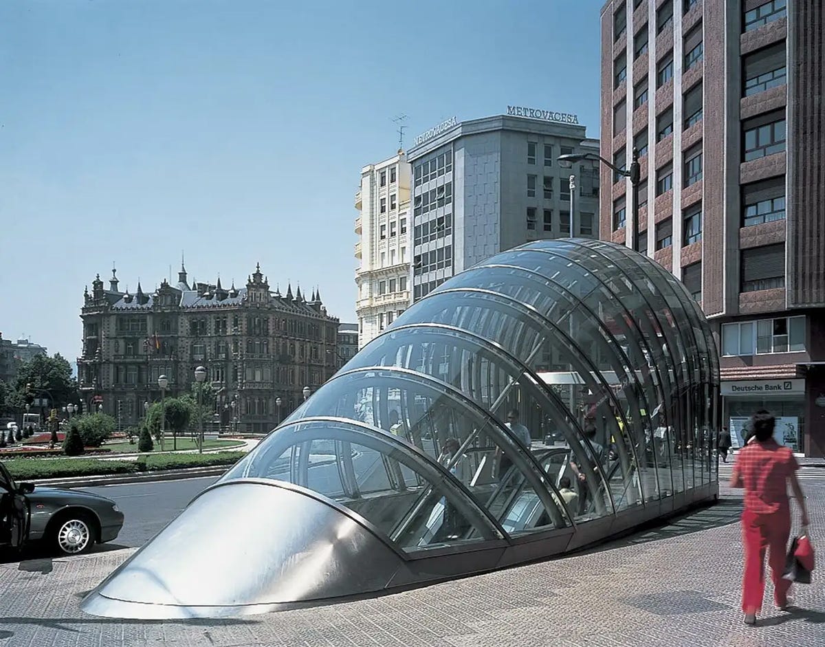
Aicher designed the identity of the metro in 1988. He died in 1991 — four years before it opened. He never rode it. If you ever visit Bilbao, take a closer look underground. What most people see as a transport system is, in reality, a cathedral of design. What I admire most about Aicher’s work is that it doesn’t need to shout. His designs quietly become part of everyday life.
VIDEO REFERENCE
A brief reflection on Otl Aicher’s legacy and the visual identity of Metro Bilbao.Source: Bilbao Fine Arts Museum, 2020.
skatepark REFERENCE
Built in 1987 on the ruins of a seafront building in Algorta, Getxo. One of the oldest concrete skateparks in Europe. Hard locals. Not an easy park to skate. Worth every second.
One last coincidence:
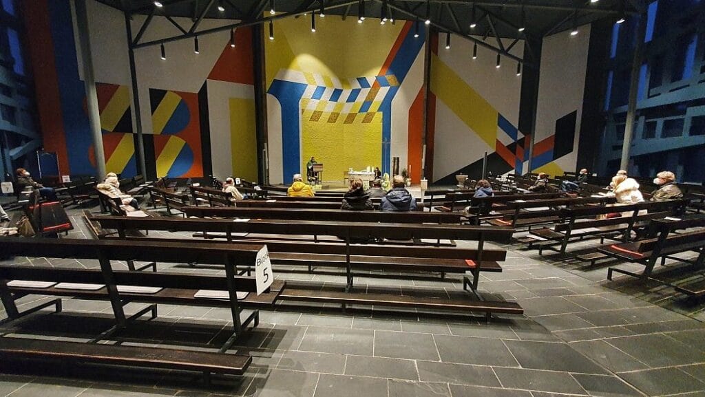
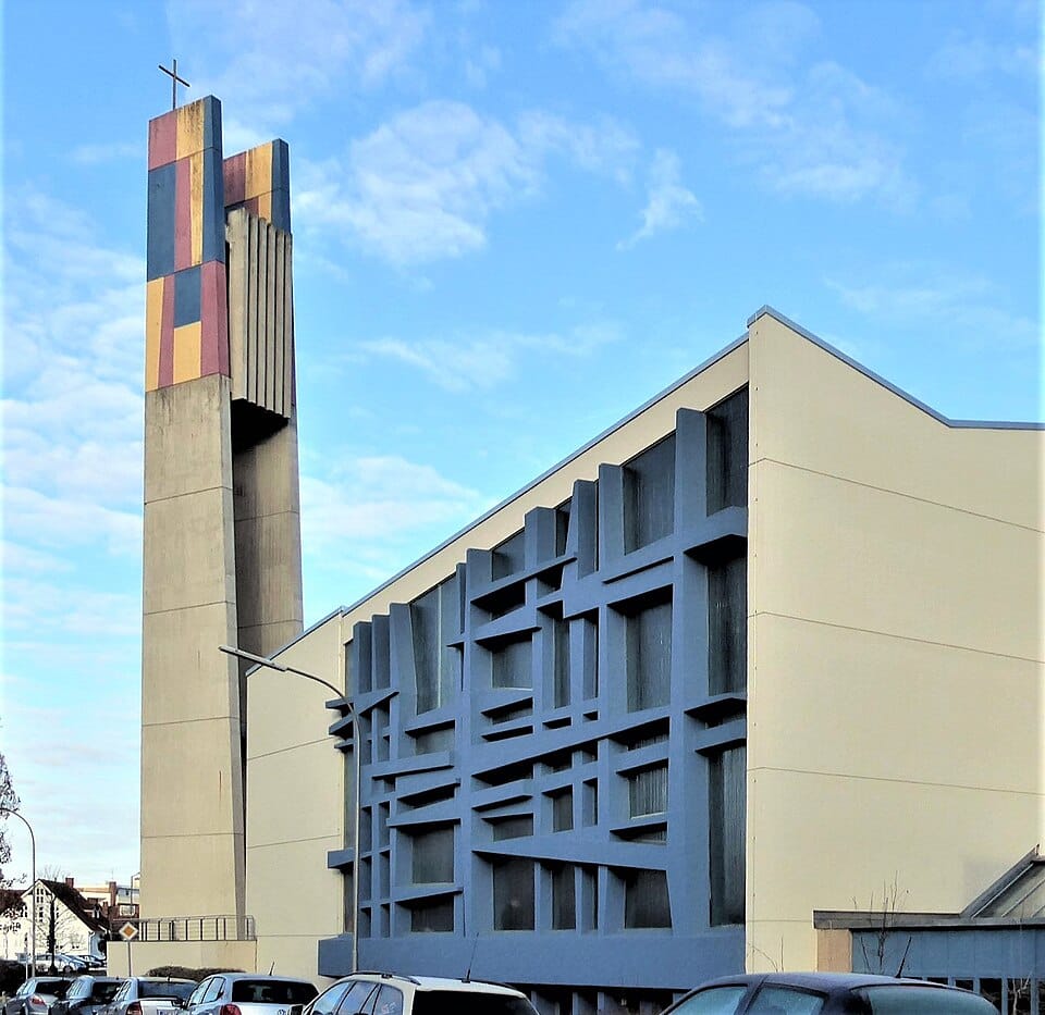
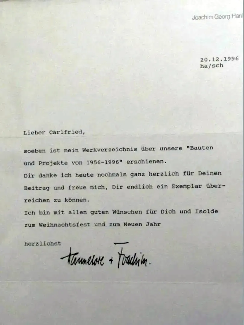
About a year ago, in Oldenburg, Germany, where my mother now lives, I was helping one of her neighbours with a printer. It’s a building for elderly people, independent apartments, shared spaces. Hannelore was one of the neighbours. When I walked into her room, I saw a geometric, meticulously ordered desk, perfectly aligned to the architecture of the room. I knew immediately this was going to be an interesting conversation.
During the conversation, I discovered she was the widow of Joachim Georg Hanke, a German architect who spent his life building churches inspired by the Bauhaus. She showed me his book. And she had known Otl Aicher personally. They were friends.
Imagine my face.
The world moves in strange beautiful loops.
CONCLUSION
How much skateboarding can you remove before a skate graphic stops being a skate graphic?
My answer: less than you think. The push is enough. Everything else is context. That question sits at the heart of skateboarding and graphic design history. That’s why I didn’t want to create something that only belongs in a skate shop. I wanted to create something that could quietly carry skateboarding into other spaces.
Got something to say, a correction, or a lead on another visual thread? Do you skate and create? Write to us. info@nosebonk.com
PREORDER
Reserve your copy.
This print is not in the shop yet. Leave your email and we’ll let you know when it drops. You’ll be the first.
More Works by Erik Ziegler
Protected: Backside Heelflip
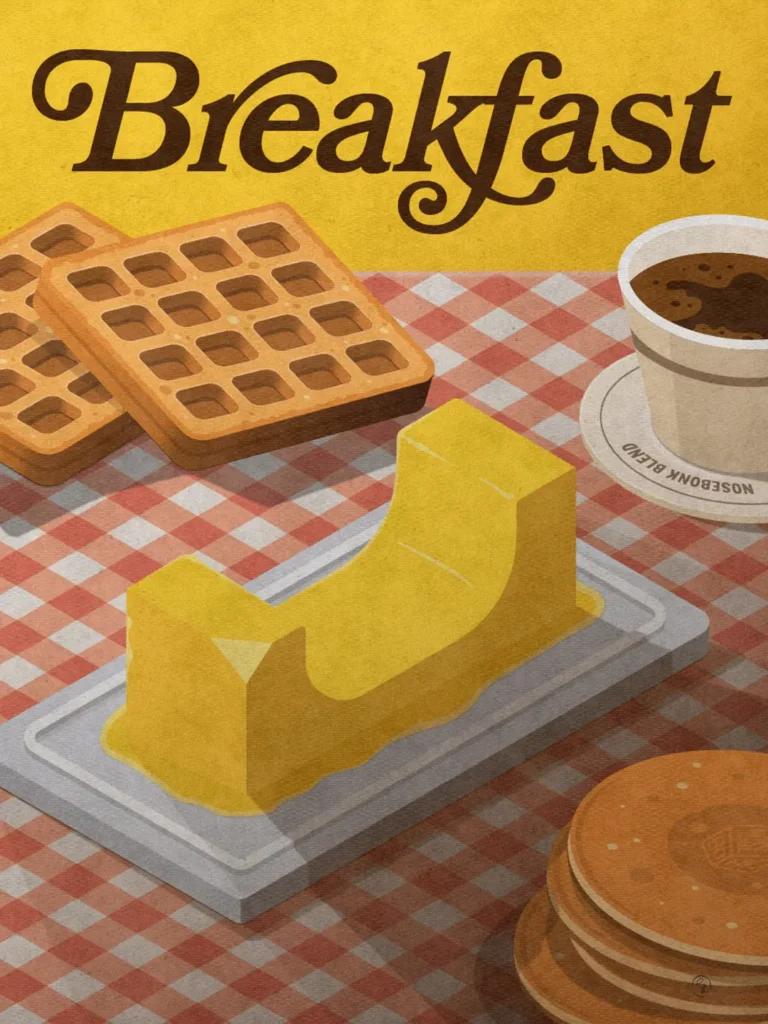
Skate Breakfast
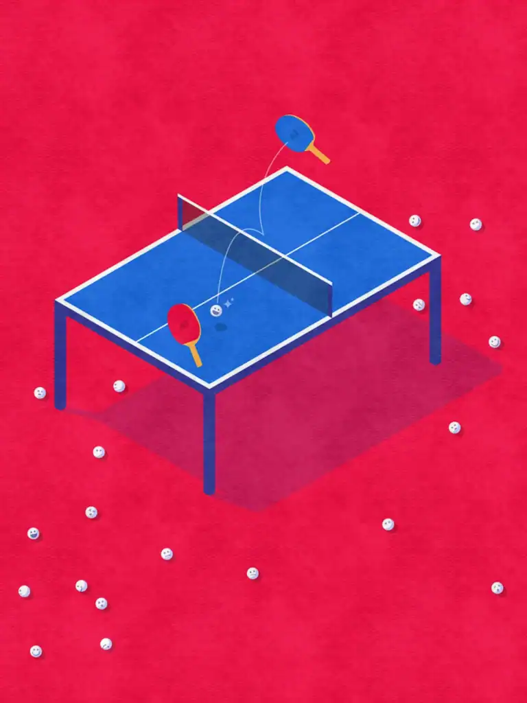
Prompt Pong
NEWSLETTER
NEW WORK,
NEW DROPS,
NEW POSTS.
Drops before they’re public.
Stories before they hit the feed.
Occasional updates from the studio.
Newsletter:
Just skateboarding
and art.
Questions